Foodstuffs
Foodstuffs is a New Zealand based, locally owned co-operative that operates well-known supermarket brands like New World, PAK'nSAVE, and Four Square. My responsibility in this project was to create a performance review dashboard with a focus on data visualisation.
Role:
Data Analytics UX Designer
Project Type:
Professional
Duration:
12 weeks


Challenges
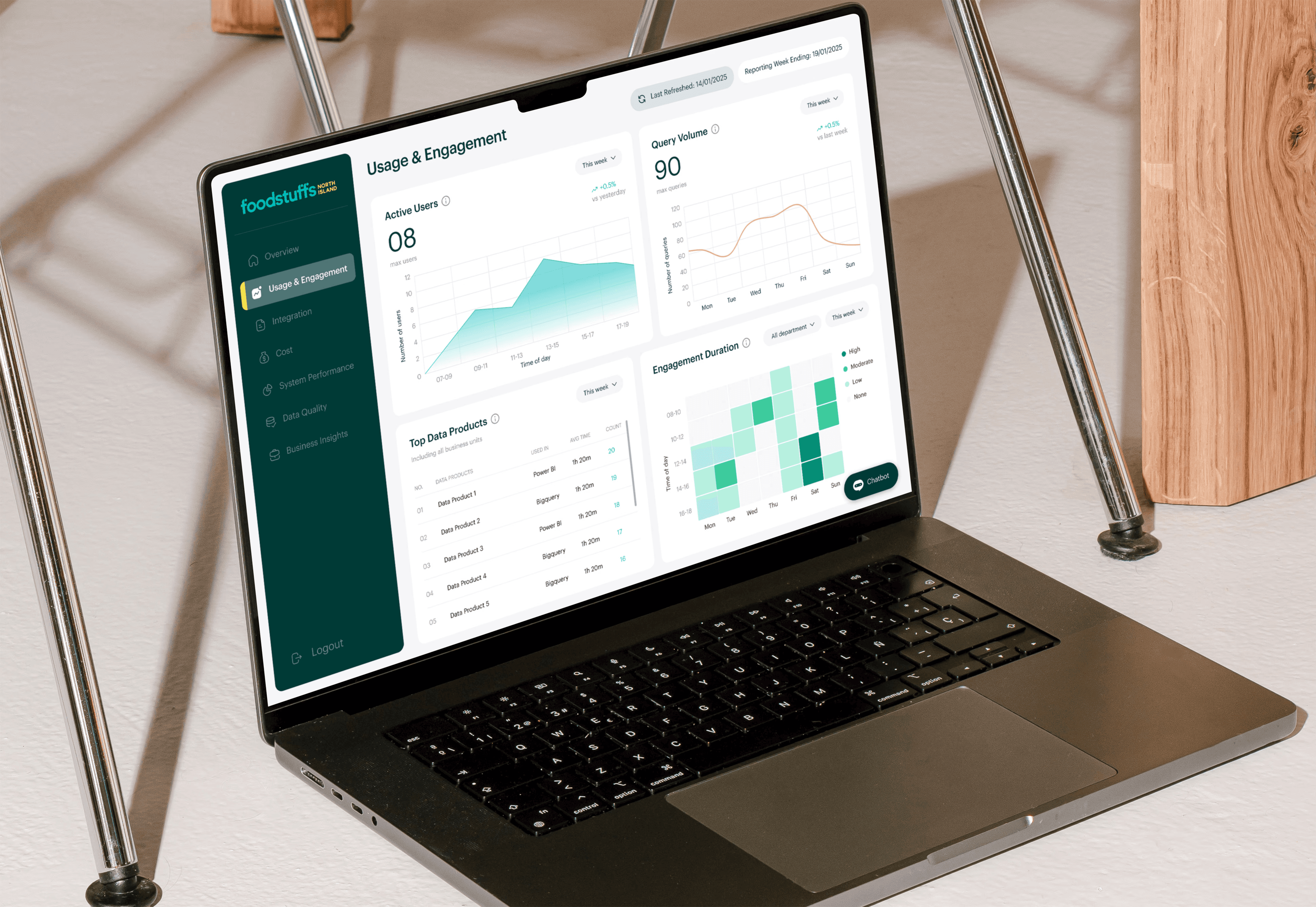
One of the key challenges I faced during this project was to ensure the visualised data remained clear and easily understandable for users with little to no data knowledge. To address this, I selected data visualisation methods that allowed trends to be identified at a glance (such as line graphs), along with card visuals to highlight key metrics like the maximum number of users and queries within the selected timeframe. Additionally, I standardised the filter options into a single format to minimise confusion and to improve the overall user experience.
My Approach
My first approach was to come up with 4-5 metrics for each of the dashboard tabs. I communicated with the Data Analytics team to make sure that the metrics are feasible and that it shows value to the business.
Once the metrics were finalised, I moved on to designing the UI of the dashboard, focusing on design accessibility and data feasibility. I decided to focus on the "Usage and Engagement" tab first, as the goal of this project was to provide a fully functioning prototype of the dashboard (one tab) in Power BI by the end of the internship. In order to select the most optimal data visualisation method, I conducted thorough research online and communicated with stakeholders to ensure that the method I chose was clear and understandable.
After the initial design was created, I conducted user interviews by presenting the dashboard to key stakeholders (Data Analytics team, UX design team) in order to receive feedback on both the technical side and the design itself. Once the feedback was gathered, I began to refine and iterate the design for an improved, user friendly product.
I then moved onto creating a dummy table in Excel and utilised the "fake" data to create the dashboard prototype in Power BI. During this stage, I communicated with Power BI experts to ask questions and address the issues I was having to visualise the data.
Results
I created a fully functioning "Usage and Engagement" Power BI dashboard prototype for both desktop and mobile. All files, design decisions, and processes I took were attached and documented in Confluence for handover.
Future Plans
The future plan for this project will be to investigate the technical side in order to implement "real" data into the Power BI prototype. Once "real" data is implemented, the next step will be to design the other tabs according to the initial metrics I have developed.